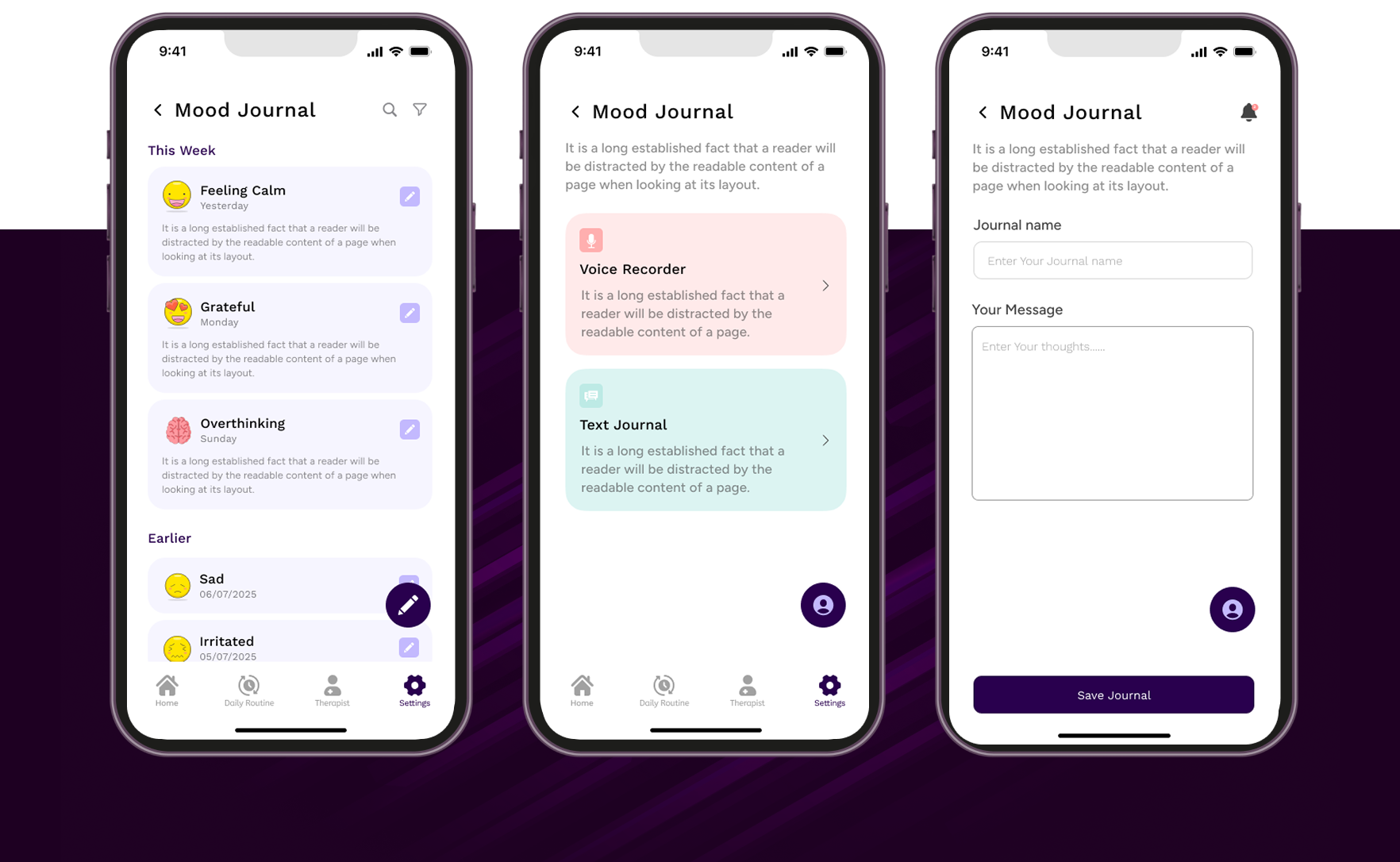
# 1. Context & Core Problem
During early exploration of existing mental health applications, a consistent pattern
emerged:
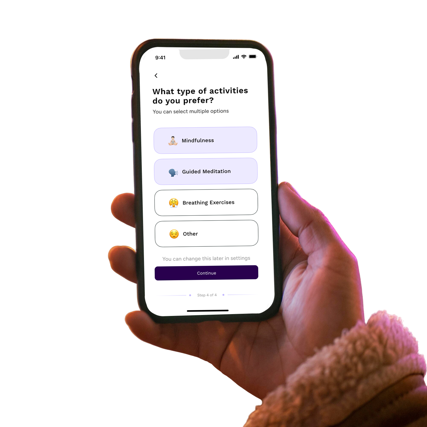
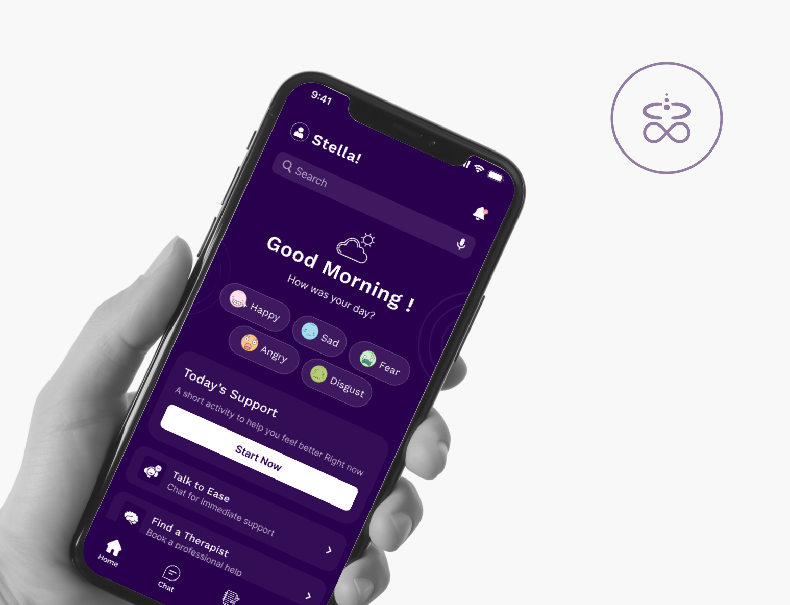
Users were not overwhelmed by a lack of features — they were overwhelmed by unclear
structure.
Across evaluated applications, participants reported:
- * Difficulty locating journaling tools
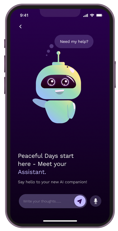
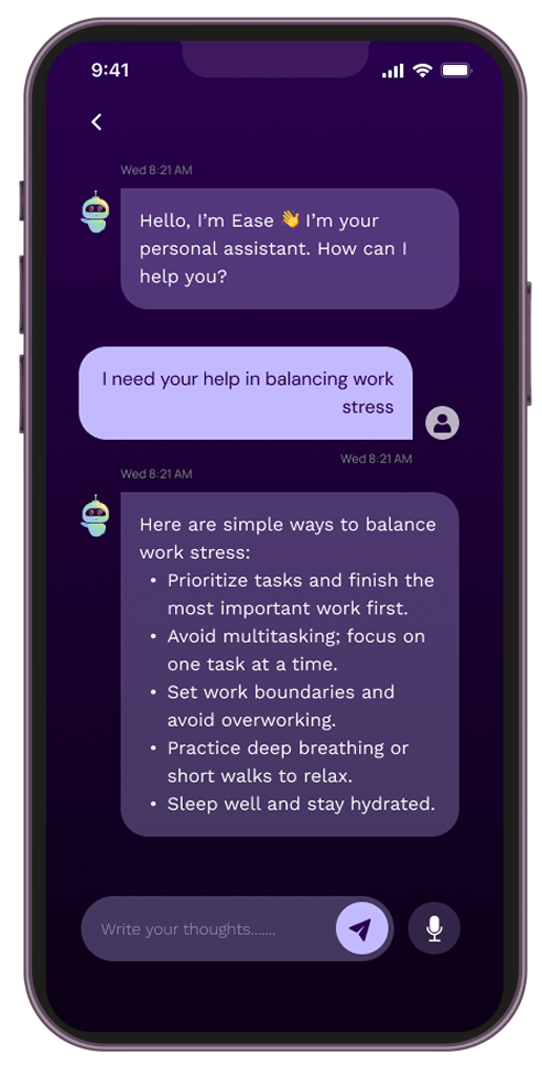
- * Uncertainty about AI response reliability
- * Hesitation during onboarding
- * Confusion about whether actions were successfully completed
Ambiguous icon-only navigation, weak confirmation feedback, and inconsistent
accessibility
implementation increased cognitive load and reduced trust.
This project reframed the challenge:

How might we improve emotional reassurance by strengthening structural clarity?


.png)
.png)
.png)